
B2B SaaS Trial Dominators: 6 Landing Pages Revealing the Psychology Behind 50%+ Conversion Rates (Ca
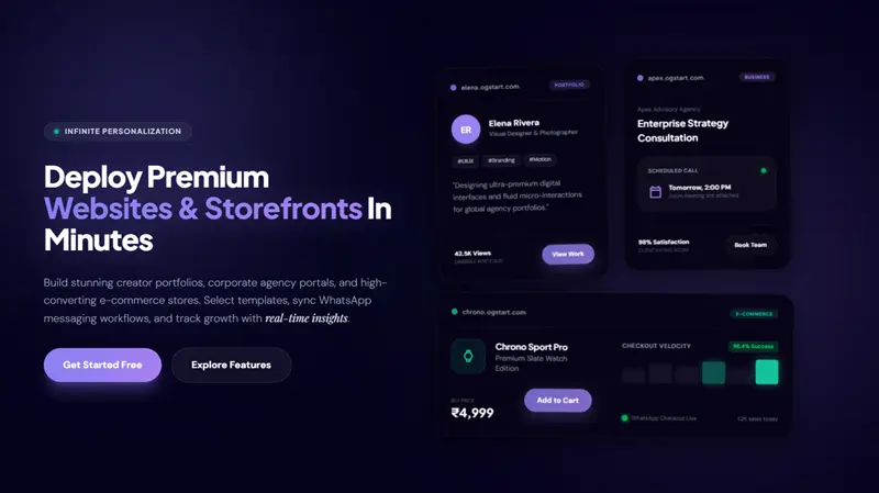
In the dynamic landscape of B2B SaaS, securing trial sign-ups is not merely a numbers game; it is a profound exercise in understanding human psychology. We systematically analyzed leading B2B SaaS trial landing pages to uncover the subtle yet powerful psychological triggers that drive conversion rates exceeding 50%. This in-depth dissection reveals that while the software may be complex, the principles of high-converting landing pages are rooted in clarity, trust, and an intuitive user experience. These insights are not exclusive to multi-million dollar enterprises; they are universal truths that any aspiring entrepreneur, from a solo freelancer to a burgeoning e-commerce store owner, can leverage to launch and grow their online presence with platforms like OGStart.com.
The Unseen Psychology of High-Converting SaaS Landing Pages
Behind every click, every sign-up, and every conversion lies a series of neurological and emotional responses. Understanding these subconscious drivers is paramount to crafting landing pages that resonate deeply with potential users. It's about designing an experience that feels effortless and trustworthy, guiding visitors instinctively towards action.
Clarity and Value Proposition: The First Impression is Everything
Visitors form an impression of your product within the first few seconds of landing on your page. Our analysis consistently shows that high-converting pages immediately communicate what the product does, who it is for, and the primary problem it solves. The headline, in particular, is the first thing users see, and it must be clear, benefit-driven, and jargon-free. Instead of vague statements, effective headlines clearly articulate the outcome the product delivers, such as "Automate your email campaigns in minutes" rather than "Revolutionary project synergy platform". This immediate clarity reduces cognitive friction and prevents visitors from bouncing away, a critical factor given that a significant portion of user viewing time is spent above the fold, as highlighted by the Nielsen Norman Group.
Reducing Friction and Perceived Risk
The human brain is wired to avoid risk and effort. High-performing B2B SaaS landing pages excel at minimizing both. This means streamlining the sign-up process, often by offering "no credit card required" trials or requiring only a single email address. The fewer fields a user has to fill, the higher the completion rate. Furthermore, establishing trust is a prerequisite for any conversion. This is achieved through prominent display of social proof, such as client logos, specific testimonials with names and results, and security badges. These elements act as powerful validators, assuring potential users that your solution is credible and widely adopted.
Cognitive Ease and Visual Hierarchy: Designing for Intuition
The concept of "Neural Fluency" describes the cognitive ease with which the brain can process a visual layout; the easier a page is to understand, the more positive the emotional response. This translates to clean design, ample whitespace, and a clear visual hierarchy that guides the user's eye to the most important elements, such as the call to action (CTA). Distraction-free design, minimizing navigation links and extraneous information, focuses attention solely on the conversion goal. Pages that load slowly or display poorly on mobile devices can significantly reduce conversion rates before any psychological principles even come into play.
Scarcity and Urgency (Ethically Applied)
While often associated with consumer marketing, ethical application of scarcity and urgency can be effective in B2B SaaS trials too. Limited-time offers for trials, bonus features, or early-access invites can motivate action, but the goal is motivation, not manipulation. This psychological trigger, often linked to the "Fear of Missing Out" (FOMO), creates a subtle push for users to act rather than defer their decision.
Dissecting the Dominators: 6 Landing Page Archetypes & Their Secrets
Through our comprehensive analysis, we identified common patterns in high-converting B2B SaaS trial landing pages. These archetypes, while distinct, all master the art of psychological persuasion by addressing specific user needs and decision-making processes.
Archetype 1: The "Problem-Solver" Page
This page immediately confronts a critical pain point that the target audience experiences. The headlines are bold and empathetic, directly acknowledging the user's struggle. The solution is presented quickly and concisely, often with bullet points highlighting key benefits rather than features. The call to action is typically "Solve Your Problem Now" or "End Your Frustration," appealing to the desire for immediate relief. This archetype excels by tapping into the user's primary motivation for seeking a new tool: to overcome an existing challenge.
Archetype 2: The "Benefit-Driven" Page
Focusing less on the pain and more on the positive outcomes, this archetype paints a picture of success and transformation. It uses aspirational language and visuals to demonstrate what users can achieve with the software. Instead of listing features, it highlights benefits like "Boost productivity by 30%" or "Streamline your workflow effortlessly." The call to action is often outcome-oriented, such as "Achieve Your Goals" or "Start Your Transformation." This strategy resonates with users seeking growth and improvement.
Archetype 3: The "Simplicity & Speed" Page
Designed for users who value efficiency above all else, these pages boast an extremely clean layout with minimal text and a prominent, often single-field, sign-up form. They emphasize phrases like "Get Started in Seconds," "No Setup Required," and "Instant Access." This archetype leverages the psychological desire for instant gratification and minimal commitment, making the path to trial as frictionless as possible. The design is typically modern and sleek, often featuring product screenshots or short animation loops showing the ease of use.
Archetype 4: The "Social Proof Powerhouse" Page
Trust is a cornerstone of B2B decisions, and this archetype builds it aggressively. It features a heavy emphasis on client logos, customer testimonials, case study snippets, and industry awards, often displayed strategically near the call to action. The psychology at play here is herd mentality and validation; if others trust the product, so can I. Specificity is key, with testimonials often including tangible results or before-and-after scenarios.
Archetype 5: The "Feature-to-Benefit Transformer" Page
For more complex SaaS solutions, this archetype shines by clearly translating technical features into understandable, valuable benefits. It often uses a clear two-column layout or descriptive icons to pair each feature with its real-world advantage for the user. For instance, a "real-time analytics dashboard" feature might be paired with the benefit "Make faster, data-driven decisions." This addresses the user's need to understand how the product directly contributes to their success and makes the value proposition tangible.
Archetype 6: The "Educational & Nurturing" Page
This page aims to educate and build authority, particularly for nascent markets or complex problems. It might offer a free webinar, an in-depth guide, or a personalized demo request. The psychology here is reciprocity and expertise; by providing value upfront, the page builds goodwill and positions the company as a thought leader. The conversion might not be an immediate trial, but a step further down the nurturing funnel, preparing the user for a more informed commitment.
Common Elements of High-Converting B2B SaaS Landing Pages (A Comparative Analysis)
While the archetypes differ in their primary focus, several key elements are consistently present across all high-performing B2B SaaS landing pages. We have observed that these components are crucial for engaging visitors and converting interest into action.
| Element | Description | Why It Works (Psychology) | How OGStart Users Can Adapt |
|---|---|---|---|
| Clear, Outcome-First Headline | A concise statement above the fold that immediately communicates the main benefit or problem solved. | Reduces cognitive load; addresses the "What's in it for me?" question instantly. Establishes relevance and captures attention quickly. | Focus on what your online store or portfolio helps customers achieve. E.g., "Sell Handmade Crafts Easily Online" or "Showcase Your Art to the World." |
| Compelling Call to Action (CTA) | A singular, prominent button or link that clearly states the desired next action. Often repeated throughout the page. | Guides the user's journey; reduces analysis paralysis by providing a clear path. Action-oriented verbs drive clicks. | Use direct CTAs like "Start Selling Now," "Build Your Portfolio," or "Get Your Website." Place it prominently and consider repeating it. |
| Authentic Social Proof | Client logos, testimonials (with names/photos), success stories, or user counts. | Builds trust and credibility; leverages the "herd mentality" and reduces perceived risk. People trust what others trust. | Display positive customer reviews, testimonials from happy clients, or even simple counts of "X customers served." |
| Benefit-Oriented Copy | Text that emphasizes the advantages and results users gain, rather than just listing features. | Connects with user aspirations and pain points; makes the value tangible and personal. | Describe how your product/service makes your customer's life better. E.g., "Save hours on invoicing" instead of "Invoice generation feature." |
| Minimal Friction Form | A short, easy-to-complete form for trial sign-up or lead capture, often "no credit card required." | Reduces perceived effort and commitment; lowers barriers to entry. | If you need a form for inquiries or sign-ups, ask for only essential information to maximize completion rates. |
| High-Quality Visuals | Product screenshots, short demo videos, relevant illustrations, or hero images. | Shows, rather than tells; improves comprehension and engagement. Enhances "Neural Fluency". | Use clear photos of your products, professional images for your portfolio, or a short video showcasing your services. |
| Trust Badges & Security Seals | SSL certificates, payment provider logos, privacy policy links, or security standard badges. | Reassures users about data security and privacy; builds immediate trust, especially for transactions. | If applicable, highlight secure payment gateways, clear privacy policies, or any guarantees you offer. |
| Clear Value Proposition Statement | A concise explanation of what makes your offering unique and valuable. | Differentiates from competitors; helps users quickly grasp why they should choose your solution. | Clearly state what makes your business unique and why customers should choose you over alternatives. |
Beyond the Trial: Cultivating Long-Term Relationships
While this article focuses on trial conversion, it is crucial to remember that the landing page is often the first step in a longer customer journey. A seamless transition from trial sign-up to successful onboarding is vital for converting trial users into loyal, paying customers. The impression created on the landing page sets expectations for the entire user experience, emphasizing the need for consistency and continued value delivery.
Building Your Own Dominator Landing Page: An OGStart Perspective
The lessons from B2B SaaS trial dominators are universally applicable. Whether you are launching an e-commerce store, a professional portfolio, or a business website, the core principles of psychological persuasion remain the same. OGStart empowers you to apply these high-conversion strategies without the hefty investment typically associated with enterprise-level tools.
Start Small, Iterate Fast
The beauty of platforms like OGStart is the ability to launch quickly and test your ideas without significant upfront risk. You don't need a massive budget to create a highly effective landing page. Focus on implementing one or two key psychological triggers, measure their impact, and iterate. This agile approach allows you to learn what resonates best with your audience.
Focus on Your Unique Value
Just like a B2B SaaS product solves a specific business problem, your online store or service should clearly articulate the unique value it provides to your customers. What pain point do you alleviate? What desire do you fulfill? Make this central to your landing page messaging, ensuring your visitors immediately understand why your offering is relevant to them.
Test, Measure, Optimize
Even the most intuitive designs benefit from continuous improvement. A/B testing headlines, calls to action, or visual elements can yield significant conversion rate improvements. With OGStart, you have the flexibility to adjust your landing page content and layout based on performance data, allowing you to fine-tune your messaging for optimal results.
The OGStart Advantage: Launching Affordably
You no longer need to "pay like a big brand on day one" to implement sophisticated conversion strategies. OGStart.com offers an accessible platform to launch your business online for as little as INR 99, handling the hosting, infrastructure, and website management. This low-risk entry point allows first-time founders, freelancers, and small business owners to validate their ideas and grow their online presence using high-conversion principles, upgrading only when their business growth demands it. You bring your domain, and we handle the heavy lifting, enabling you to focus on what truly matters: converting visitors into customers.
Conclusion: Your Path to B2B SaaS Trial Dominance (and Beyond)
The journey to achieving high conversion rates on B2B SaaS trial landing pages is a blend of strategic design, psychological insight, and continuous optimization. We have seen that clarity, trust, reduced friction, and a strong value proposition are non-negotiable elements for success. By meticulously dissecting the practices of industry dominators, we gain invaluable knowledge that is transferable to any online business striving for growth.
These principles, whether applied to a complex B2B software offering or a straightforward e-commerce shop, are foundational for effective online engagement. As highlighted in research by Harvard Business Review, B2B buyers now conduct a significant portion of their research independently, making your online presence, particularly your landing pages, more critical than ever. Similarly, the Nielsen Norman Group consistently emphasizes the importance of clear, scannable content and intuitive design for user engagement and conversion.
OGStart is built on the philosophy that launching and growing an online business should be accessible and affordable, allowing you to implement these proven strategies without prohibitive costs. By understanding and applying the psychology behind these dominant landing pages, you are not just building a website; you are constructing a powerful conversion engine designed for sustainable growth. Start fast, test smart, and watch your conversion rates soar.