
Mobile CRO Mastery: 9 Funnel Fixes for E-commerce Buyers
Mobile CRO Mastery: 9 Funnel Fixes for E-commerce Buyers
In today's fast-paced digital landscape, the mobile device is no longer just an accessory; it is the primary gateway for millions of customers to discover, explore, and purchase products online. For any business launching its online presence, especially a small business, understanding and optimizing for mobile commerce is not just an advantage—it's a fundamental necessity. Mobile Conversion Rate Optimization (CRO) is the art and science of guiding your mobile visitors seamlessly through your website or online store, transforming browsers into loyal buyers.
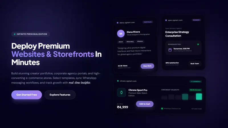
At OGStart, we understand the ambition of first-time founders, local businesses, and creative entrepreneurs. You want to Launch Premium Websites & Storefronts - OGStart without the hefty price tag, focusing your energy on your passion rather than complex technical hurdles. This guide is crafted to empower you with actionable strategies to master mobile CRO, ensuring that every rupee invested in your online venture yields maximum returns. We systematically analyzed countless mobile e-commerce journeys to distil the most impactful fixes that can significantly boost your conversion rates.
The Mobile-First Imperative: Why Your Small Business Can't Ignore CRO
The ubiquity of smartphones has fundamentally reshaped consumer behavior. From casual browsing during commutes to late-night shopping, mobile devices offer unparalleled convenience. For businesses, this means your online storefront must be just as accessible, intuitive, and efficient on a smartphone screen as it is on a desktop. Neglecting mobile optimization is akin to closing your doors to a significant portion of your potential market.
For entrepreneurs starting small, like those using OGStart to launch for just INR 99, every conversion counts. Mobile CRO isn't about making minor tweaks; it's about systematically improving the user experience to remove friction points, build trust, and encourage purchases. It's about ensuring your business can compete effectively even against larger players, by being smarter and more responsive to customer needs on their preferred device.
Understanding the Mobile E-commerce Landscape
Mobile traffic now dominates web usage. Reports consistently show that over half of all global website traffic originates from mobile devices. More importantly, mobile commerce (m-commerce) sales are rapidly growing, projected to account for a substantial majority of all e-commerce sales. This shift isn't just about traffic; it's about intent. Mobile users are often on the go, seeking quick information, making impulse purchases, or browsing while multitasking. Their expectations for speed, clarity, and ease of use are incredibly high.
Consider the behaviors: a customer discovers your product on Instagram, clicks a link, and lands on your mobile site. If the site is slow, cluttered, or difficult to navigate, they will bounce. This isn't just a lost sale; it's a lost opportunity to build a relationship. We recognize that for freelancers, creators, and local businesses, your online presence is often your first impression. Making that impression count on mobile is paramount.
The OGStart Advantage: Building for Mobile Success from Day One
One of the core philosophies behind OGStart is to enable you to launch fast and validate ideas affordably, without having to "pay like a big brand on day one." This principle extends to mobile responsiveness. When you create an e-commerce store, portfolio website, or business site with OGStart, our platform handles the complexities of hosting, platform infrastructure, and website management. This means our templates and underlying technology are built with mobile-first principles in mind, ensuring your site looks great and performs well across all devices from the moment it goes live.
While you still need to buy and connect your own domain, OGStart provides the robust, scalable foundation. This frees you to focus on your products, content, and customers, knowing that the technical aspects of mobile compatibility are expertly managed. You can start with an OGStart subdomain and seamlessly connect your custom domain later, all while maintaining a strong, mobile-optimized presence.
Decoding the Mobile E-commerce Funnel: Key Stages for Optimization
To effectively optimize for mobile conversions, we must understand the typical customer journey, or funnel, and identify potential friction points at each stage. While simplified here, these stages represent critical touchpoints where strategic CRO fixes can make a substantial difference.
Funnel Stage 1: Awareness & Discovery
This is where potential customers first encounter your brand, perhaps through social media, search engine results, or an advertisement. On mobile, this initial interaction must be captivating and incredibly fast. The goal here is to pique interest and encourage a click to your website or a specific product page. A slow loading page, even at this initial stage, can cause immediate abandonment.
Funnel Stage 2: Consideration & Engagement
Once on your site, customers move into the consideration phase. They are exploring products, reading descriptions, looking at images, and comparing options. On mobile, clear product presentation, intuitive navigation, and easily accessible information are crucial. This is where detailed product pages, customer reviews, and clear calls to action (CTAs) are vital. Users are assessing whether your offering meets their needs.
Funnel Stage 3: Conversion & Checkout
This is the moment of truth – when a customer decides to make a purchase. The mobile checkout process must be exceptionally smooth, secure, and require minimal effort. Any friction here—long forms, unexpected fees, confusing navigation—will lead to cart abandonment. This stage demands absolute clarity and trust.
Funnel Stage 4: Post-Purchase
While often overlooked in CRO discussions, the post-purchase experience on mobile is vital for retention and repeat business. Confirmation emails, shipping updates, and customer support access should be mobile-friendly. A positive post-purchase experience reinforces trust and encourages customers to return.
9 Crucial Mobile CRO Funnel Fixes That Convert Phone Browsers into Loyal E-commerce Buyers
Here are nine practical, modern, and beginner-friendly fixes designed to supercharge your mobile e-commerce conversions. These strategies are particularly effective for businesses built on platforms like OGStart, where the technical heavy lifting is handled, allowing you to focus on user experience.
1. Optimize Page Speed for Lightning-Fast Loading
Mobile users are notoriously impatient. A study by Google found that 53% of mobile site visits are abandoned if pages take longer than three seconds to load. For a small business, every second counts.
How to Fix:
- Compress Images: Use tools to reduce image file sizes without sacrificing quality. OGStart's platform helps with this, but always upload optimized images.
- Leverage Browser Caching: Ensure your website leverages caching to store elements, so repeat visitors load pages faster. OGStart handles server-side optimizations for you.
- Minimize Code: Clean and efficient code (HTML, CSS, JavaScript) contributes to faster loading. OGStart's streamlined platform is designed with this in mind.
- Prioritize Above-the-Fold Content: Ensure the most important content loads first, giving users immediate value.
For more detailed insights on optimizing your site's performance, consider exploring resources from web performance authorities like Google's web.dev/fast/, which offers tools and guides for improving page speed across all devices.
2. Simplify Navigation with Intuitive Menus
A cluttered or complex navigation menu on a small screen is a conversion killer. Mobile users need to find what they're looking for quickly and effortlessly.
How to Fix:
- Hamburger Menus: Use the universally recognized hamburger icon for your main menu to save space.
- Clear Categories: Group products and content into logical, concise categories.
- Visible Search Bar: Place a prominent search bar (magnifying glass icon) at the top of your mobile site, as many users prefer to search directly.
- Minimal Depth: Avoid deep menu structures. Aim for users to reach any product or page within 2-3 taps.
3. Showcase High-Quality, Mobile-Optimized Product Images & Videos
On mobile, visuals are king. Customers can't physically touch your products, so images and videos must do the heavy lifting.
How to Fix:
- High-Resolution, Zoomable Images: Provide multiple angles and allow users to zoom in to see details.
- Short Product Videos: Embed brief, engaging videos that demonstrate product usage or key features.
- Consistent Sizing: Ensure all images are consistently sized and optimized for quick loading on mobile. OGStart helps ensure images are displayed correctly.
- Image Alt Text: Not just for SEO, but for accessibility, helping visually impaired users understand your products.
4. Streamline Forms and Checkout Processes
The checkout is where many mobile conversions are lost. Long, complicated forms are a major deterrent.
How to Fix:
- Guest Checkout Option: Don't force users to create an account immediately. Offer guest checkout.
- Auto-Fill & Autofocus: Enable browser auto-fill for common fields and ensure form fields automatically focus when tapped.
- Progress Indicators: Show users where they are in the checkout process (e.g., "Step 1 of 3").
- Mobile Keyboard Optimization: Use appropriate input types (e.g., numeric keyboard for phone numbers/credit cards).
- Minimize Fields: Only ask for absolutely essential information.
5. Implement Clear, Action-Oriented Calls-to-Action (CTAs)
Your CTAs are the signposts guiding users to their next step. On mobile, they need to be unmissable.
How to Fix:
- Prominent Placement: CTAs like "Add to Cart" or "Buy Now" should be easily visible and within thumb's reach.
- Contrasting Colors: Use colors that stand out from the rest of your page design.
- Concise Language: Use clear, action-oriented text (e.g., "Shop Now," "Learn More," "Get Started").
- Adequate Sizing: Ensure buttons are large enough to be easily tapped without accidental clicks.
- Consistency: Maintain a consistent look and feel for your CTAs across your site.
6. Enhance Mobile Responsiveness and Layout
True responsiveness goes beyond just shrinking your desktop site. It's about designing a user experience specifically for mobile. OGStart's platform excels at this, providing a responsive foundation for your website, but it's crucial to understand the principles. We've compiled a comparison of common mobile design approaches to highlight the importance of truly responsive design:
| Feature | Responsive Design (Optimal for Mobile CRO) | Adaptive Design (Good, but less flexible) | Non-Responsive / Desktop-First (Poor for Mobile CRO) |
|---|---|---|---|
| Layout & Content Adjustment | Fluidly adjusts to any screen size; content reflows. | Delivers different, pre-defined layouts for specific screen sizes. | Stays fixed, requiring zooming and horizontal scrolling. |
| User Experience | Seamless, intuitive, minimal effort. | Generally good, but may have gaps for uncommon device sizes. | Frustrating, difficult navigation, high bounce rate. |
| Image & Media Handling | Optimizes images for display size, loads only necessary assets. | Can serve different image versions based on device. | Serves large desktop images, slowing load times. |
| Maintenance & SEO | Single codebase, easier to manage; preferred by search engines. | Multiple versions can increase maintenance complexity. | Poor SEO signals due to bad user experience. |
| Ideal Use Case | All websites, especially e-commerce, blogs, and dynamic content. | Specific web applications or sites with distinct device needs. | Avoid entirely for modern web presence. |
How to Fix:
- Fluid Grid Layouts: Use relative units (percentages) for widths instead of fixed pixels.
- Flexible Images & Media: Images should scale within their containers.
- Thumb-Friendly Design: Place interactive elements where thumbs naturally rest for easier one-handed use.
- Test on Real Devices: Don't just rely on simulators. Test your site on various smartphones and tablets.
7. Leverage Social Proof & Customer Reviews
In the absence of a physical storefront, trust is built through the experiences of others. Social proof is incredibly powerful on mobile, where quick decisions are often made.
How to Fix:
- Prominent Review Sections: Display customer ratings and reviews directly on product pages.
- User-Generated Content: Feature photos or videos from satisfied customers (with their permission).
- Trust Badges: Showcase security badges (SSL, payment processors) near the checkout.
- Integrate Testimonials: Short, impactful testimonials can be placed strategically on landing pages.
8. Offer Multiple and Familiar Payment Options
Limiting payment options can lead to significant cart abandonment. Mobile users expect convenience and security.
How to Fix:
- Popular Options: Include widely used payment methods like credit/debit cards, net banking, and popular UPI apps (e.g., Google Pay, PhonePe).
- Digital Wallets: Offer integration with mobile wallets like Apple Pay or Google Pay for one-tap checkout.
- "Buy Now, Pay Later" (BNPL): Consider integrating BNPL options if relevant to your target audience.
- Clear Payment Icons: Display accepted payment method logos prominently in the footer and checkout process.
9. Personalization & Retargeting Strategies
Once a customer has interacted with your brand, leverage that data to create a more personalized experience and bring them back if they didn't convert initially.
How to Fix:
- Personalized Product Recommendations: Suggest products based on browsing history or previous purchases.
- Abandoned Cart Reminders: Send automated, friendly reminders to users who left items in their cart.
- Segmented Email/SMS Campaigns: Tailor follow-up communications based on user behavior.
- Retargeting Ads: Use ad platforms to show targeted ads to users who visited your site but didn't convert.
Putting It All Together: Launching and Growing with Confidence
Mastering mobile CRO might seem like a daunting task, but for businesses leveraging platforms like OGStart, much of the foundational work is already done. Our goal is to provide you with a powerful yet accessible platform where you can focus on these conversion strategies, rather than getting bogged down by infrastructure.
Remember, the journey of building a successful online business is iterative. You launch fast, you learn, and you grow. With OGStart, you can start your e-commerce store, portfolio, or business website for just INR 99. You don't pay like a big brand on day one. As your business grows and your conversion rates climb thanks to these mobile optimization efforts, you can seamlessly upgrade your plan to meet your expanding needs.
Every click, every tap, every scroll on a mobile device is an opportunity. By implementing these 9 mobile CRO fixes, you're not just making your website better; you're building a more resilient, customer-centric business ready for sustained growth. We believe in empowering entrepreneurs to succeed without unnecessary financial burden. So, what are you waiting for? It's time to Let's Launch Your First Project | OGStart and transform those mobile browsers into loyal customers.