
Mobile E-commerce Traps: Fix Abandonment & Boost Sales
Mobile E-commerce Traps: Fix Abandonment & Boost Sales
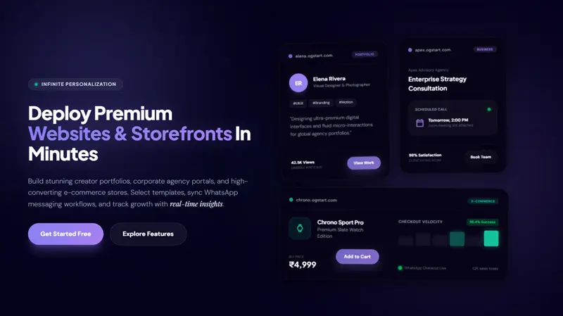
In today's digital landscape, a seamless mobile experience isn't just a luxury; it's a fundamental requirement for online business success. With a significant and growing portion of online traffic originating from smartphones and tablets, neglecting mobile optimization is akin to leaving money on the table. At OGStart, we understand that first-time founders, creators, and local businesses need an online presence that performs flawlessly across all devices, especially mobile, without breaking the bank. Our mission is to help you Launch Premium Websites & Storefronts - OGStart for an accessible entry point of Rs. 99, allowing you to grow and upgrade only when your business truly demands it. This article systematically analyzes the most common 'instant abandonment' traps plaguing mobile e-commerce sites and provides actionable strategies to fix them, ensuring your online venture thrives from day one.
We've observed a critical shift: mobile e-commerce isn't merely an alternative to desktop shopping; for many, it's the primary, and often sole, method of interacting with brands online. This paradigm shift means that common mobile betrayals, often stemming from a desktop-first design mentality, can instantly deter potential customers and lead to significant lost sales. Our goal is to equip you with the knowledge to identify and rectify these issues, transforming frustrating user experiences into smooth, conversion-friendly journeys.
The Imperative of Mobile Optimization in E-commerce
The ubiquity of smartphones has fundamentally reshaped consumer behavior. From discovering new products on social media to making impulse purchases, mobile devices are at the heart of the modern shopping experience. Ignoring this reality is a costly oversight for any business hoping to establish a strong online presence.
Recent data underscores this trend. According to Statista, global mobile retail commerce sales continue to show robust growth, accounting for an ever-larger share of total e-commerce. This isn't just a statistic; it represents billions of potential customers interacting with your brand through their mobile screens. If their experience is anything less than exceptional, they will simply move on to a competitor.
For entrepreneurs launching their first online store or expanding their local business, the implications are clear: your mobile site must be fast, intuitive, and conversion-focused. This foundational understanding guides our approach at OGStart, where we handle the complex infrastructure, hosting, and platform management, allowing you to focus on your products and customers. We engineer our platform to inherently support mobile responsiveness, giving you a strong head start.
Trap 1: The Agony of Slow Loading Speeds and Unoptimized Images
Nothing kills user enthusiasm faster than a sluggish website. In the mobile world, where connections can be variable and attention spans short, every second counts. Users expect instant gratification; if your mobile e-commerce site takes more than a few seconds to load, a significant percentage will abandon it before ever seeing your products. We systematically analyzed numerous e-commerce sites and consistently found that slow loading times are among the primary drivers of mobile abandonment.
Understanding the Impact
- High Bounce Rates: A slow site is often immediately abandoned, meaning users leave before interacting with any content.
- Frustrated Users: A negative initial experience can sour a potential customer's perception of your brand.
- Lower Search Rankings: Search engines like Google prioritize fast-loading, mobile-friendly sites in their results.
- Reduced Conversions: Even if users wait, a slow site creates friction, making them less likely to complete a purchase.
Common Causes of Slowdowns
- Large, Unoptimized Images: High-resolution images meant for desktop displays are often the biggest culprits.
- Excessive JavaScript and CSS: Too many scripts or bloated stylesheets can significantly delay rendering.
- Unoptimized Server Responses: Slow server-side processing can lead to extended wait times.
- Lack of Caching: Without proper caching, the browser has to re-download all resources on every visit.
Practical Solutions
Addressing slow loading speeds requires a multi-faceted approach:
- Image Optimization:
- Compress images without sacrificing quality using tools like TinyPNG or online compressors.
- Use modern image formats like WebP where supported, which offer superior compression.
- Implement "lazy loading" for images, so they only load when they become visible in the user's viewport.
- Serve appropriately sized images based on the user's device.
- Minimize and Combine Resources:
- Minify CSS and JavaScript files by removing unnecessary characters and comments.
- Combine multiple CSS or JavaScript files into fewer requests to reduce server calls.
- Leverage Browser Caching: Configure your server to tell browsers to store certain files (like logos, CSS, JS) locally for future visits, speeding up repeat loads.
- Utilize a Content Delivery Network (CDN): A CDN distributes your website's static assets across servers globally, delivering content from a server geographically closer to the user, thereby reducing latency.
- Prioritize Above-the-Fold Content: Load critical content that appears on the screen first, deferring non-essential elements. This gives users the perception of a faster load.
While some of these sound technical, the good news for OGStart users is that we handle much of the underlying infrastructure. Our platform is designed with speed and efficiency in mind, leveraging modern hosting and optimization techniques. However, users still play a role in optimizing their content, especially images.
Trap 2: Cluttered Interfaces & Poor Navigation on Small Screens
What works on a large desktop monitor often fails spectacularly on a tiny smartphone screen. A cluttered mobile interface, packed with too much information, small text, or tiny clickable elements, overwhelms users and makes finding products a frustrating ordeal. Poor navigation design can lead to users getting lost, unable to find what they're looking for, or struggling to complete simple actions. Our experience confirms that clarity and simplicity are paramount in mobile design.
The Perils of a Busy Screen
- Information Overload: Too many elements on screen simultaneously create cognitive overload.
- Difficult Interaction: Tiny buttons, links, or text fields are hard to tap accurately with a finger.
- Hidden Pathways: Important categories or features buried deep within obscure menus lead to abandonment.
- Increased Error Rates: Mis-taps and difficulty in entering information create friction.
Designing for Clarity and Ease
- Minimalist Design Principles: Embrace a "less is more" approach. Focus on essential elements and clear visual hierarchy.
- Intuitive Navigation:
- Use standard mobile navigation patterns like the hamburger menu (but ensure its icon is clear and visible).
- Implement clear breadcrumbs to show users their current location within the site structure.
- Ensure product categories are logical, concise, and easily accessible.
- Large, Touch-Friendly Elements: Buttons, links, and forms should have ample spacing and large enough tap targets to be easily clickable by a finger. Google recommends a minimum of 48x48 device-independent pixels for touch targets.
- Clear Calls to Action (CTAs): Buttons like "Add to Cart," "Buy Now," or "Checkout" should be prominent, unambiguous, and strategically placed.
- Effective Search Functionality: A visible and well-performing search bar is crucial for users who know what they want. Include auto-suggest and filter options.
OGStart's templates and design framework are built with mobile-first principles, providing a clean slate for your brand. We empower users to customize their storefronts while adhering to responsive design best practices, ensuring your site looks great and functions perfectly on any device. When you Let's Launch Your First Project | OGStart, these mobile considerations are inherently built into the platform's core.
Trap 3: The Labyrinth of Cumbersome Checkout Processes
You've done the hard work: a user found your product, loved it, and added it to their cart. Now comes the final hurdle – the checkout. A complicated, multi-step, or error-prone checkout process is one of the most significant reasons for cart abandonment. On mobile, where screen real estate is limited and users might be on the go, every extra click, every unclear field, and every forced step amplifies frustration.
Reasons for Checkout Drop-offs
- Forced Account Creation: Many users just want to buy and leave; forcing them to create an account before purchase is a major deterrent.
- Too Many Steps/Fields: Long forms with unnecessary information requests.
- Lack of Progress Indicators: Users don't know how many steps are left or where they are in the process.
- Poor Form Design: Tiny input fields, difficult-to-use keyboards, or lack of auto-fill.
- Unexpected Costs: Shipping costs or taxes revealed too late in the process.
- Limited Payment Options: Not offering preferred payment methods.
Streamlining for Success
To turn cart abandoners into paying customers, optimize your mobile checkout process:
- Guest Checkout Option: Always offer a clear "Guest Checkout" option. Allow users to create an account *after* their purchase if they wish.
- Minimize Form Fields: Ask only for absolutely essential information. Pre-fill known data where possible.
- Single-Page or Accordion Checkout: Consider consolidating steps into one scrolling page or an accordion layout to minimize page loads.
- Clear Progress Indicators: Visually show users where they are in the checkout process (e.g., "Step 1 of 3").
- Auto-fill and Smart Keyboards: Enable browser auto-fill for address and payment details. Use appropriate input types (e.g., numeric keypad for phone numbers).
- Transparent Pricing: Display all costs, including shipping and taxes, as early as possible.
- Multiple Payment Gateways: Offer a variety of popular payment options, including credit/debit cards, UPI, mobile wallets (e.g., Paytm, Google Pay), and potentially even "buy now, pay later" options.
- Error Handling: Provide clear, real-time error messages that guide users to correct mistakes without having to re-enter everything.
OGStart integrates with secure payment gateways and provides robust e-commerce features designed to facilitate a smooth checkout flow. While the specifics of your payment gateway might vary, our platform aims to reduce technical barriers, allowing you to implement a conversion-optimized checkout process.
Trap 4: Lack of Mobile-Specific Features & Accessibility
Many websites are still designed with a "desktop-first" mindset, then retrofitted for mobile. This often results in a poor user experience characterized by tiny text, small interactive elements, and a general lack of features that leverage the unique capabilities of mobile devices. Furthermore, neglecting accessibility principles alienates a significant portion of potential customers, limiting your market reach and potentially exposing your business to compliance issues. We emphasize that true mobile optimization goes beyond just responsiveness; it involves enhancing the experience.
The Overlooked Aspects
- Tiny Text and Inadequate Spacing: Hard to read and navigate.
- Non-Optimized Forms: Difficult to type into, requiring constant zooming.
- Lack of Mobile Payment Integration: Forcing users to manually enter card details instead of using one-tap mobile payment options.
- Absence of Click-to-Call/Map: Missing opportunities to connect users directly with your business.
- Poor Accessibility: Websites that are not perceivable, operable, or understandable by people with disabilities.
Enhancing the Mobile Experience
- Readable Typography: Use sufficiently large font sizes (at least 16px for body text) and ensure adequate line height and letter spacing for readability on small screens.
- Responsive Forms: Design forms that automatically resize and reflow for mobile. Use large, clear input fields and labels.
- Mobile Payment Options: Integrate popular mobile payment solutions like Apple Pay, Google Pay, UPI, or local digital wallets for one-tap purchasing.
- Location-Based Features: For local businesses, include "click-to-call" phone numbers and "click-to-map" directions directly on your mobile site.
- Accessibility Best Practices:
- Ensure high contrast ratios between text and background.
- Provide alt text for all images.
- Ensure all interactive elements are keyboard-navigable (important for screen reader users).
- Use semantic HTML correctly.
- Haptic Feedback: For certain interactions, subtle vibrations can enhance the user experience (though use sparingly).
OGStart empowers you to build websites that are not only responsive but also thoughtfully designed for mobile interactions. Our platform handles the underlying technical complexities, allowing you to focus on creating rich, accessible content and a truly mobile-first user experience. For more in-depth learning, explore our Resources & Insights - OGStart section.
Desktop-First Design Pitfalls vs. Mobile-First Design Advantages
The distinction between designing for desktop and then adapting for mobile, versus designing for mobile first and then scaling up, is critical. We've compiled a comparison to highlight why a mobile-first approach is superior for modern e-commerce.
| Feature/Aspect | Desktop-First Design Pitfalls | Mobile-First Design Advantages |
|---|---|---|
| Performance | Often leads to slow mobile loading due to unoptimized assets and unnecessary code designed for larger screens. | Prioritizes speed and efficiency; loads only essential elements, resulting in faster mobile load times and better user retention. |
| User Experience (UX) | Cluttered interfaces, tiny clickable elements, complex navigation, and poor readability on small screens. Users often "pinch and zoom." | Clean, intuitive interfaces with clear CTAs, large touch targets, and simplified navigation. Enhances usability and reduces friction. |
| Content Prioritization | All content from desktop site is crammed onto mobile, leading to information overload and difficulty in finding key information. | Forces prioritization of critical content and functions, ensuring users see the most important information first. "Content is king, but context is God." |
| Development Process | Often involves "fixing" a desktop site for mobile, which can be inefficient, costly, and lead to compromises in design and functionality. | Streamlines development; builds a solid foundation for mobile that can then be progressively enhanced for larger screens with additional features. |
| SEO & Ranking | Can negatively impact mobile search rankings due to poor performance and user experience. Google uses mobile-first indexing. | Boosts mobile SEO due to faster loading times, better user engagement, and adherence to Google's mobile-first indexing criteria. |
| Conversion Rates | Higher abandonment rates and lower conversions due to frustration and difficulty in completing purchases. | Improved conversion rates due to a smooth, intuitive, and efficient mobile shopping experience, reducing friction points. |
The OGStart Advantage: Building for Mobile Success from Day One
At OGStart, our platform is engineered with these mobile-first principles embedded into its core. We understand that for many of our users – first-time founders, Instagram and WhatsApp sellers, freelancers, and local businesses – launching an online presence means needing a solution that just works, especially on mobile. We handle the heavy lifting so you don't have to navigate these complex technical waters alone.
When you launch your online business with OGStart for Rs. 99, you're not just getting a basic website; you're gaining access to a robust platform that inherently addresses many of the mobile abandonment traps we've discussed:
- Optimized Hosting & Infrastructure: We take care of hosting, server configuration, and platform scaling. This means your website benefits from fast load times and reliable performance, crucial for mobile users.
- Responsive Design Templates: Our templates are built to be inherently responsive, meaning your site automatically adapts and looks great on any screen size, from smartphones to tablets and desktops.
- Simplified Management: We handle the complexities of website/store management, platform infrastructure, and scaling. This allows you to focus on what matters most: your products, customers, and business growth, rather than the technical intricacies of mobile optimization.
- Affordable Validation: Our "start small, launch fast, validate ideas affordably" philosophy is perfectly aligned with mobile e-commerce. You can test your business idea with minimal upfront investment (Rs. 99) and ensure your customers have a great experience on their preferred device.
We believe you shouldn't have to "pay like a big brand on day one" for a mobile-optimized platform. With OGStart, you get enterprise-level infrastructure and mobile-friendly design capabilities right from the start, allowing you to "upgrade only when growth demands it."
Actionable Steps for OGStart Users
While OGStart provides a powerful foundation, your content and ongoing management play a vital role in perfecting the mobile experience. Here’s what you can do:
- Prioritize Visuals: Even with OGStart's image optimization, always upload high-quality images that are appropriately sized. Use tools to compress them further before uploading if necessary.
- Concise Content: Write short, scannable paragraphs and use bullet points for product descriptions and key information. Mobile users skim.
- Test, Test, Test: Regularly view your website on various mobile devices (your own, a friend's, different browsers) to catch any display or interaction issues.
- Review Your Navigation: Ensure your menu structure is logical, easy to understand, and not too deep. Are your most important categories easily accessible?
- Simplify Checkout: While OGStart provides the framework, ensure you activate guest checkout and configure your payment options to be as diverse and friction-less as possible.
- Monitor Analytics: Pay attention to mobile bounce rates and conversion rates in your analytics. These metrics will tell you if your efforts are paying off and where further improvements might be needed.
Conclusion: Embrace Mobile, Empower Your Growth
The future of e-commerce is undeniably mobile. Overcoming the common 'instant abandonment' traps on mobile sites isn't just about fixing technical glitches; it's about understanding and respecting how your customers interact with your brand in their daily lives. By prioritizing speed, clarity, and ease of use, you can transform a frustrating mobile experience into a seamless journey that converts visitors into loyal customers.
At OGStart, we are committed to providing the foundational tools and infrastructure that empower entrepreneurs to launch and grow their online businesses successfully, affordably, and with confidence. We handle the complexities of hosting and mobile responsiveness, allowing you to focus on your vision. Start small, launch fast, and build a robust, mobile-ready online presence with OGStart. Your business deserves a platform that supports its growth, not hinders it.