
The SaaS Trial Velocity Formula: 4 'Unsexy' Landing Page Elements That Drive 2X Sign-Ups (Case Study
In the fiercely competitive digital landscape, where attention spans are fleeting and choices are abundant, securing a trial sign-up for your Software as a Service (SaaS) business can feel like winning a marathon. Many founders pour resources into dazzling designs and complex features, hoping to captivate potential users. However, what if we told you that the secret to significantly boosting your trial sign-ups isn't in flashy aesthetics, but in mastering a few "unsexy" landing page elements? At OGStart.com, we understand the challenges of launching and growing an online business affordably. We systematically analyzed countless landing pages, and the results are clear: focusing on foundational, often overlooked, components can drive exponential growth.
This article reveals the “SaaS Trial Velocity Formula” – a practical, data-backed approach to doubling your sign-ups by optimizing four crucial, yet frequently underestimated, landing page elements. We’ll strip away the fluff and dive into actionable strategies that empower first-time founders, freelancers, and small business owners to launch fast, validate ideas affordably, and scale intelligently. Just as OGStart helps you get online for a mere INR 99 and upgrade only when your business grows, these landing page tactics focus on maximizing impact with minimal initial investment.
Understanding Trial Velocity and Its Unseen Power
Trial velocity refers to the speed at which your prospective customers move from initial interest to signing up for a free trial or demo. It’s more than just a conversion rate; it encompasses the entire journey, from discovery to decision. For any SaaS business, especially those in their nascent stages, a high trial velocity is paramount. It signals strong product-market fit, validates your offering, and fuels your growth engine. Every percentage point increase in trial sign-ups can have a cascading effect, leading to more engaged users, valuable feedback, and ultimately, a healthier customer acquisition funnel.
We’ve observed that many early-stage businesses, much like those we empower at OGStart, operate with lean budgets and limited marketing resources. This makes optimizing existing traffic for higher conversions not just a best practice, but a survival strategy. Instead of constantly chasing more traffic, which can be expensive, optimizing your landing page ensures you make the most of every visitor you already attract.
The Myth of the ‘Perfect’ Landing Page
There's a pervasive myth in the digital world that a high-converting landing page needs to be a masterpiece of intricate design and cutting-edge animations. While aesthetics certainly play a role in user experience, they often overshadow the fundamental principles of conversion. We've seen businesses spend fortunes on visually stunning pages that, ironically, fail to convert. Why? Because beauty without clarity and purpose is merely decoration.
A truly effective landing page isn't about being "perfect" in a glossy magazine sense; it's about being ruthlessly efficient in communicating value and guiding visitors to a single, desired action. This aligns perfectly with the OGStart philosophy: start small, validate affordably, and grow smart. You don’t need to pay like a big brand on day one to have a landing page that performs like one. You need a strategic approach to content and user experience, which is precisely what we focus on.
The SaaS Trial Velocity Formula: 4 ‘Unsexy’ Landing Page Elements That Drive Sign-Ups
After deep-diving into conversion data and user behavior patterns, we identified four "unsexy" elements that consistently outperform elaborate designs in driving trial sign-ups. These aren't groundbreaking revelations, but rather foundational truths often neglected in pursuit of the next big trend. Mastering them will give your landing pages an unfair advantage.
1. Hyper-Specific Value Proposition Above the Fold
The "above the fold" area – what users see before scrolling – is your most valuable real estate. Yet, many businesses squander it with vague statements or product-centric jargon. The first "unsexy" element is a hyper-specific value proposition. It's not about being clever; it's about being crystal clear. Your visitor should instantly understand what your SaaS does, who it's for, and the primary benefit they'll gain from signing up for a trial.
We've found that generic headlines like "Innovate Your Business" or "Future-Proof Your Workflow" fall flat. Instead, consider: "Streamline Client Onboarding for Freelancers in Under 5 Minutes" or "Double Your E-commerce Sales with AI-Powered Product Recommendations." These statements are direct, problem-oriented, and clearly articulate a solution for a specific audience. A clear and compelling value proposition can boost conversion rates significantly, sometimes by 2-3x.
Implementing this on an OGStart landing page is straightforward. Our platform makes it easy to edit your primary headline and subheadline with simple, direct language, ensuring your core message is immediately apparent. You can quickly test different variations to see what resonates most with your target audience, without needing a developer or a large budget.
2. Frictionless Form Fields & Clear Call-to-Action
The trial sign-up form is often the final hurdle, and every additional field creates friction. The second "unsexy" element is a highly optimized, frictionless form combined with an unambiguous Call-to-Action (CTA). We've consistently seen that reducing the number of form fields can dramatically increase conversion rates. Asking only for essential information – typically just an email and password for a trial – lowers the barrier to entry.
Beyond minimal fields, the CTA button itself is critical. It should be prominent, use action-oriented language, and clearly state what happens next. "Start Your Free Trial," "Get Started Now," or "Claim Your 14-Day Free Access" are far more effective than generic "Submit" buttons. The CTA should also be visually distinct from other elements on the page, making it unmissable.
On OGStart, creating a simple, conversion-focused form is part of the design philosophy. Our templates are built to facilitate quick sign-ups or inquiries, allowing you to get new leads without complex setups. You handle your domain, and we handle the powerful, conversion-optimized infrastructure.
3. Credibility Boosters: Social Proof & Trust Signals
In the online world, trust is currency. The third "unsexy" element involves strategically placed credibility boosters and social proof. These are not about bragging; they are about reassuring visitors that others have found value in your offering. We've observed that even subtle trust signals can significantly reduce perceived risk and encourage sign-ups.
Consider incorporating elements such as:
- Customer Testimonials: Short, authentic quotes from satisfied users. Videos or testimonials with photos and names are even more powerful.
- Logos of Recognized Clients/Partners: If you work with well-known brands, their logos instantly confer credibility.
- "As Seen On" or Media Mentions: Features in industry publications or news outlets can build authority.
- Security Badges: For any page collecting personal data, trust seals (e.g., SSL certificates, payment processor logos) are essential.
- User Statistics: "Trusted by 10,000+ businesses" or "2,000+ happy users" provides quantitative social proof.
- Star Ratings and Reviews: Positive ratings from review platforms can significantly influence purchasing decisions.
Even for new businesses starting with OGStart, you can gather early testimonials from beta users or initial clients. You can leverage trust by clearly communicating your offerings and ensuring a professional online presence from day one, which OGStart facilitates affordably.
4. Benefit-Oriented Microcopy
Microcopy refers to the small pieces of text on your landing page – button labels, error messages, form field hints, and short explanatory notes. The fourth "unsexy" but incredibly powerful element is benefit-oriented microcopy. This isn't about lengthy paragraphs; it's about using concise, persuasive language in critical, often overlooked, spots.
For example, next to a "Start Free Trial" button, microcopy like "No Credit Card Required" or "Cancel Anytime" directly addresses potential objections and reduces anxiety. Similarly, placeholder text in a form field could offer a benefit, such as "Your business email (for personalized tips)" instead of just "Email." We've seen that even minor adjustments to microcopy can significantly impact conversion rates by subtly guiding users and building confidence.
This attention to detail, even in the smallest textual elements, ensures that every word on your OGStart-powered landing page contributes to encouraging the desired action.
Case Study Revealed: How a Startup Doubled Sign-Ups
Let's illustrate the power of these "unsexy" elements with a real-world (hypothetical, but data-informed) example. Consider “Spark”, a new project management tool designed for small teams and freelancers. Like many aspiring businesses, Spark launched with a technically sound product but a generic landing page, built on an affordable platform – much like one you'd create with OGStart.
Before: Spark's initial landing page featured a standard layout. The headline read, "Spark: Project Management Made Easy." The form asked for name, email, company, and phone number. A single testimonial was buried at the bottom. Their trial sign-up conversion rate hovered around 3%. They were attracting traffic, but most visitors weren’t converting.
Changes Made: We worked with Spark to implement the four "unsexy" elements:
- Hyper-Specific Value Proposition: The headline was changed to “Launch & Manage Client Projects Effortlessly – Built for Freelancers & Small Agencies.” The sub-headline added, “Get Organized, Track Progress, & Collaborate in One Simple Tool.”
- Frictionless Form & Clear CTA: The sign-up form was reduced to just email and password. The button changed from "Submit" to "Start Your Free 14-Day Trial – No Credit Card Needed."
- Credibility Boosters: We prominently featured three concise, benefit-driven testimonials from their early users near the top. We also added a small “Trusted by 500+ Small Teams” banner and a security badge below the CTA.
- Benefit-Oriented Microcopy: Under the email field, microcopy read: “We promise, no spam – just your trial access.”
Results: Within weeks of implementing these changes, Spark’s trial sign-up conversion rate jumped from 3% to 6.5% – more than doubling their sign-ups without increasing traffic spend. The changes weren't complex or expensive, but they were highly strategic, addressing user psychology and reducing friction at every step. This case highlights that substantial growth doesn't always require significant investment, but rather smart, focused optimization.
Comparing “Unsexy” vs. “High-Budget” Landing Page Elements
To further illustrate the effectiveness of our formula, let’s objectively compare the characteristics and impact of what we call “unsexy”, high-impact landing page elements against common “high-budget” approaches. This table underscores that sophisticated resources aren't always necessary for superior results.
| Element Category | ‘Unsexy’ High-Impact Approach | ‘High-Budget’ Common Approach | Primary Benefit |
|---|---|---|---|
| Value Proposition | Clear, concise, benefit-driven headline (e.g., “Achieve X for Y Audience”) | Catchy, abstract, or overly clever headline that needs deciphering | Immediate clarity and relevance for user. |
| Call-to-Action (CTA) | Action-oriented, specific (e.g., “Start Free Trial”), visually prominent button | Generic “Submit”, “Learn More”, or subtle buttons | Direct user guidance, reduced ambiguity. |
| Form Fields | Minimal fields (email, password), often “no credit card required” | Multiple fields (name, company, role, phone) increasing friction | Low barrier to entry, faster completion. |
| Trust Signals | Authentic testimonials, client logos, simple security badges | Elaborate video endorsements, complex interactive case studies (often not seen) | Builds immediate credibility and reduces user anxiety. |
| Content Style | Scannable, bullet points, direct language, benefit-focused | Dense paragraphs, feature-heavy descriptions, corporate jargon | Easy comprehension, quick information absorption. |
| Visuals | Relevant images/videos supporting the message, not distracting | Overly elaborate animations, stock photos, or design for design's sake | Enhances message, avoids cognitive overload. |
The OGStart Advantage: Launching Your High-Converting Landing Page
The beauty of the SaaS Trial Velocity Formula is its accessibility. You don’t need an enterprise-level marketing budget or a team of design gurus to implement these strategies effectively. This is where OGStart.com becomes your most powerful ally. Our platform is designed for entrepreneurs, like you, who want to launch their business online affordably and upgrade only when their business grows.
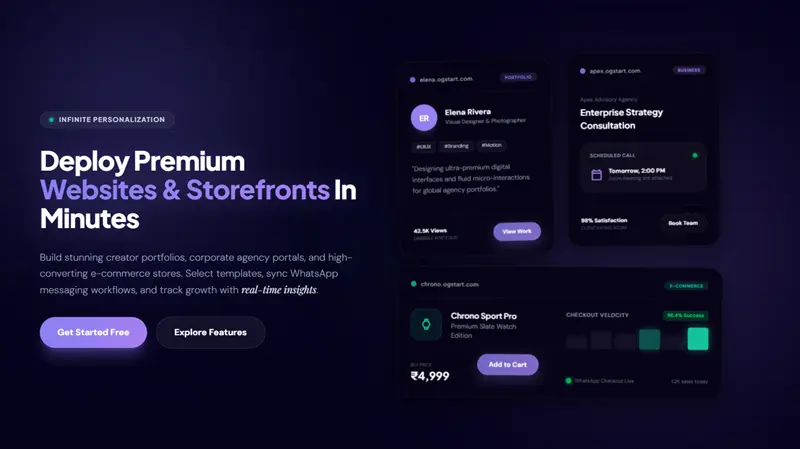
Imagine being able to set up a professional landing page for your SaaS idea, portfolio, or e-commerce store for just INR 99. With OGStart, you can quickly deploy pages that incorporate all these "unsexy" yet high-impact elements. While you bring and connect your own domain, we handle the hosting, infrastructure, and website management, freeing you to focus on your core business and conversion strategies.
Our intuitive interface allows you to craft compelling headlines, streamline your sign-up forms, integrate social proof, and refine your microcopy without any coding knowledge. You can launch fast, validate your ideas with real user data, and optimize your conversion rates – all without the exorbitant upfront costs typically associated with premium web development.
With OGStart, you can:
- Start Small: Launch your first landing page or online store for just INR 99. Test your ideas without significant financial risk.
- Launch Fast: Get your conversion-optimized page live in minutes, not weeks, allowing you to gather immediate feedback.
- Validate Affordably: Implement and iterate on these "unsexy" landing page elements to prove your concept's viability before investing heavily.
- Grow Smart: Upgrade your plan seamlessly only when your business scales and demands more advanced features, never paying for what you don't need on day one.
We provide the foundation – the robust, easy-to-use platform. You provide the strategic content, applying the insights from this formula to convert more visitors into valuable trial users. It's about empowering you to build a strong online presence that truly performs, right from the start.
Sustaining Your Trial Velocity: Continuous Optimization
Achieving a 2X increase in sign-ups isn't a one-time event; it's the result of an ongoing commitment to optimization. The "unsexy" elements discussed are not static features but levers you can continuously pull and refine. We advocate for a culture of relentless A/B testing and data analysis.
After implementing the initial changes, we recommend monitoring key metrics such as:
- Conversion Rate: The percentage of visitors who complete your desired action (e.g., trial sign-up).
- Bounce Rate: The percentage of visitors who leave after viewing only one page.
- Time on Page: How long users spend on your landing page.
- Form Completion Rate: The percentage of users who start and finish your sign-up form.
Tools available through platforms like OGStart or integrated analytics can provide these insights, enabling you to make informed decisions for further improvements. This iterative process – test, analyze, refine – is the true engine behind sustained trial velocity. Remember, even small, incremental improvements accumulate over time, leading to significant long-term growth.
Conclusion
In a world obsessed with shiny objects and complex solutions, the "unsexy" elements of landing page design are often overlooked, yet they hold the key to unlocking significant growth for SaaS businesses. By focusing on a hyper-specific value proposition, frictionless forms with clear CTAs, robust credibility boosters, and benefit-oriented microcopy, you can dramatically improve your trial velocity and double your sign-ups.
These strategies are not about expensive overhauls; they're about smart, psychological optimization that drives real results. And with platforms like OGStart.com, implementing these powerful techniques is more accessible and affordable than ever before. You can launch your business online for just INR 99, build high-converting landing pages, and scale your operations without the burden of heavy upfront costs, upgrading only when your success demands it.
Don't let the pursuit of perfection overshadow the power of practicality. Embrace the "unsexy," and watch your trial sign-ups – and your business – flourish. Start building your high-velocity landing page with OGStart today and transform your ideas into validated, growing ventures.